How to Choose the Perfect Color for Your Sign to Attract Customers? A Real Guide From the Streets of NYC
Let me tell you something that took years of working on NYC storefronts to fully appreciate. Color is never just color.
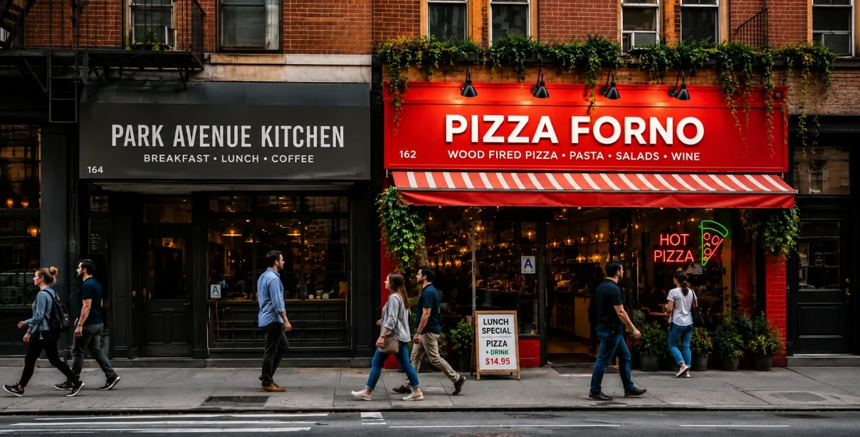
I have watched a restaurant on Queens Boulevard struggle for months with a beautiful sign — great design, perfect placement, quality materials — and still fail to pull foot traffic. We went back, changed the color scheme from a muted olive green to a warm bold red with cream lettering, and within three weeks the owner called us to say his lunch rush had visibly increased.
Nothing else changed. Same location. Same menu. Same staff. Different color.
That experience is not unique in our world. It happens more often than most business owners realize and the reason comes down to something deeper than personal taste or aesthetic preference. It comes down to how the human brain actually processes color and what happens in those 7 seconds when a potential customer first sees your sign before their rational mind even gets involved.
This is what we are going to unpack today. Not in a generic textbook way but in a real, practical, street-tested way that applies specifically to NYC businesses competing for attention in some of the most visually saturated commercial corridors in the world.
Why Color Decisions Feel Personal But Are Actually Scientific?
Most business owners choose their sign colors the same way they choose their living room paint — based on what they personally like or what feels right for their brand personality. And while brand personality absolutely matters, the mistake is stopping there.
Here is the uncomfortable truth. Your personal color preference is largely irrelevant to your customer's brain.
A study published in the journal Optics and Photonics found that color increases brand recognition by up to 80%. A separate landmark research piece published in the Journal of Business Research found that up to 90% of snap product judgments are based on color alone. These are not soft marketing opinions. These are documented neurological responses that happen before conscious thought occurs.
The Pantone Color Institute — which has studied color psychology and consumer behavior for decades — consistently finds that different colors trigger measurably different emotional and physiological responses across large population groups regardless of individual preference.
This is the foundation everything else builds on. You are not choosing colors for yourself. You are choosing colors for your customer's nervous system.
The NYC Factor: Why Color Works Differently Here?
Before jumping into specific colors I want to make a point that almost every generic color psychology article misses entirely.
New York City is visually overwhelming by design. Times Square alone has been studied as one of the most visually stimulating environments on earth. Walking down any major commercial street in Manhattan, Brooklyn, or the Bronx means your eyes are processing hundreds of competing signs, lights, displays, and visual messages simultaneously.
This means the standard color advice that works in a suburban strip mall does not automatically translate to an NYC environment. In a quieter retail setting a subtle sage green boutique sign can feel elegant and inviting. On a busy stretch of Fordham Road in the Bronx that same sign becomes completely invisible within three seconds.
In NYCITY SIGNS your color choice needs to do two things simultaneously — stand out from the visual noise around it AND communicate the right emotional message about your business. That is a harder brief than most people realize and it is why getting professional guidance matters more in this city than almost anywhere else.
Color by Color What the Research Actually Shows?
Red: Urgency, Appetite, and Immediate Action
Red is the most studied color in consumer psychology and the findings are remarkably consistent. Red increases heart rate slightly, creates a mild sense of urgency, and stimulates appetite — which is why it dominates the restaurant and food service industry globally.
A study from the University of Rochester found that red specifically increases the speed of decision making in consumers. For businesses where you need customers to act quickly — fast food, retail sales, promotional offers — red is scientifically justified, not just aesthetically popular.
In NYC red signs cut through visual noise effectively because the human eye is neurologically wired to notice red as a priority signal. Think of how your eye catches a red awning or red channel letters on a busy block even when you are not actively looking for it.
Best for: Restaurants, food trucks, retail sales environments, convenience stores, urgent service businesses.
Blue: Trust, Professionalism, and Calm
Blue is the world's most universally liked color according to multiple large-scale international surveys including research published by YouGov covering 10 countries and over 10,000 respondents. More relevantly for business signage, blue consistently triggers associations of trustworthiness, competence, and reliability.
This is not accidental. Banks, law firms, medical offices, and technology companies have used blue for decades precisely because consumer research validates its trust associations. For NYC businesses in professional services, healthcare, financial services, or any sector where customer trust is the primary conversion barrier, blue is your most powerful tool.
The practical NYC application: blue signs are particularly effective on streets with warmer-colored competitors because the contrast makes them stand out while simultaneously communicating stability.
Best for: Law offices, medical and dental practices, financial services, tech businesses, insurance agencies.
Yellow and Gold: Attention and Optimism
The human eye processes yellow faster than any other color. This is a physiological fact rooted in how our visual cortex works. Yellow sits at the peak of the eye's sensitivity curve meaning it literally registers before other colors in our peripheral vision.
For NYC street-level signage this makes yellow and gold particularly powerful for businesses that need to capture attention from moving traffic or pedestrians who are not actively looking for your type of business. You are essentially intercepting their attention before they have decided to look.
Research from the Sign Research Foundation specifically notes that high-contrast combinations — particularly yellow or white text on dark backgrounds or dark text on yellow backgrounds — achieve the highest legibility scores at distance. For NYC storefronts where customers may be reading your sign from across a wide street or from a moving vehicle, this legibility advantage is practically significant.
Best for: Taxi and transport services, children's businesses, gyms, cafes, promotional retail.
Green: Health, Nature, and Premium Quality
Green carries two distinct associations depending on shade and context. Bright greens communicate freshness, health, and natural products. Deeper emerald and forest greens communicate premium quality, wealth, and sophistication.
With NYC's growing health-conscious consumer base, green has become increasingly powerful for businesses in wellness, organic food, fitness, and sustainable products. A Nielsen Global Health and Wellness Survey found that 73% of global consumers say they would definitely or probably change their consumption habits to reduce environmental impact. Green signage visually signals alignment with these values before a customer reads a single word.
For premium service businesses in neighborhoods like the Upper East Side, Tribeca, or Park Slope — deep rich greens communicate the kind of quiet luxury that resonates with those specific customer demographics.
Best for: Health food stores, organic restaurants, spas, wellness centers, premium boutiques, sustainable businesses.
Black and White: Luxury, Clarity, and Timelessness
Black is the color of luxury in signage. Consistently. Every major luxury brand from Chanel to Rolls Royce defaults to black because decades of consumer research confirm its premium associations. For NYC businesses positioned at the higher end of their market, black signage communicates that you are not competing on price — you are competing on quality and exclusivity.
White creates the strongest contrast against dark backgrounds and communicates cleanliness, simplicity, and modern professionalism. In NYC's increasingly competitive wellness and technology sectors, white-dominant signage has become the visual shorthand for modern premium positioning.
Best for: High-end retail, luxury services, fine dining, upscale salons, premium professional services.
The Contrast Rule That Overrides Everything Else
Here is something I tell every single client before we finalize any sign color decision. Your color psychology choices mean nothing if people cannot read your sign from a practical distance.
The Sign Research Foundation's legibility research establishes clear contrast ratios for maximum sign readability. The highest performing combinations are black text on yellow background, white text on dark blue background, black text on white background, and yellow text on black background. These combinations maintain legibility at the greatest distances and in the widest range of lighting conditions.
For NYC specifically — where your sign must perform in bright midday sun, overcast winter days, and nighttime artificial lighting simultaneously — contrast is not optional. It is the foundation that color psychology gets built on top of.
Your Neighborhood Matters More Than You Think
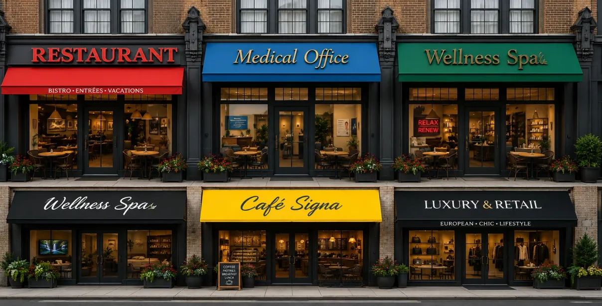
One genuinely NYC-specific factor that national signage guides never discuss — your immediate block context should influence your color choice significantly.
Walk your block before finalizing any color decision. Stand where your customers will stand and look at the competing visual environment around your future sign location. If every competitor within 200 feet uses red and white you have a genuine opportunity to stand out with a contrasting palette. If your block is dominated by dark signs a bright warm color will immediately draw the eye to your location.
In NYC your sign is not just communicating your brand — it is competing in a specific visual context that changes block by block and neighborhood by neighborhood. A color that works perfectly in Astoria might be completely wrong for SoHo simply because of what surrounds it.
Three Questions to Ask Before Finalizing Your Sign Color
After years of working with NYC businesses these three questions cut through all the confusion and lead to consistently better color decisions.
First, what is the single most important thing you want a new customer to feel within 3 seconds of seeing your sign? Trust, hunger, excitement, calm, luxury? Let that emotion drive your primary color choice.
Second, what colors dominate your immediate block competition? Choose something that creates genuine contrast rather than blending into the visual noise.
Third, does your color combination maintain strong contrast and legibility at the distance your customers will typically be when they first see your sign? Test this before committing.
You need free consultation to fill out our contact form, we will help you in a better way.
Conclusion: Color Is Your First Conversation With Every Customer
Every customer who walks past your sign has a conversation with your business before they ever speak to you or read your menu or see your prices. That conversation happens entirely in color, contrast, and the emotional response those visual signals trigger in their brain.
Getting that conversation right is not about picking your favorite color or copying what a competitor does. It is about understanding what your specific customers in your specific NYC neighborhood need to feel in order to stop walking and step through your door.
The science is clear. The psychology is documented. The NYC street reality is something we work with every single day.
Choose your colors with the same intention you bring to every other part of your business and your sign will work harder for you than almost any other marketing investment you make.
Read Our More Blogs
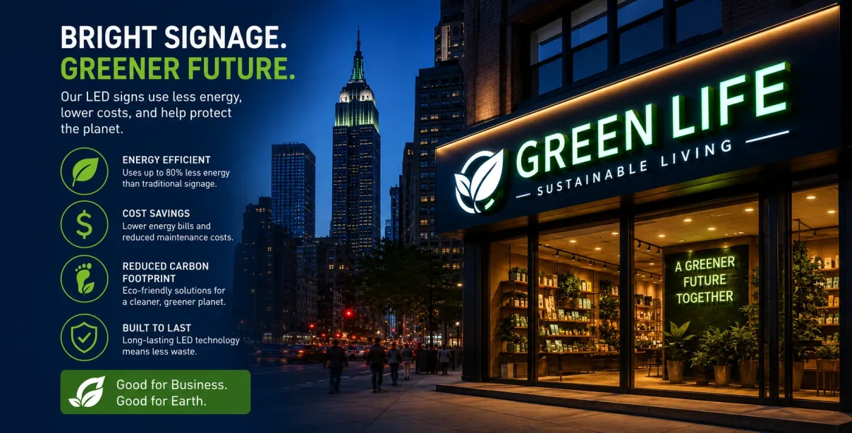
How Will LED Signs Be a Sustainable Option? The Future of Energy-Efficient Business Signage
LED signs consume up to 75% less energy than traditional alternatives, contain no hazardous materials, and deliver substantially lower total ownership costs. For NYC business owners, the choice of LED signage is not just the sustainable option — it is the smart business option.
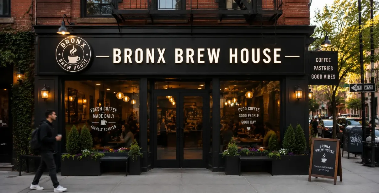
How Can Signs Make Your Customer Repeatable? The Psychology Behind Signage and Brand Recall
Discover how strategic business signage improves brand recall, customer retention, and repeat visits using proven psychology and real data.
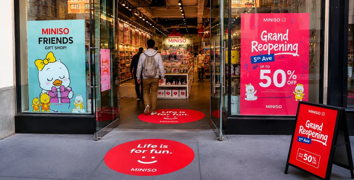
How Are Floor and Window Decals a Visual Identity for Your Business?
Discover how floor decals and window decals boost brand identity, improve visibility, enhance customer experience, and attract more customers in competitive markets like NYC.